As a UI/UX Designer at Factory 42, I am currently working on the development of two AR mobile games to be released on a very short schedule. Our goal originally was to release a Location Based Experience at the Natural History and Science Museums of London, but the COVID-19 pandemic forced us to find another way to work together, giving birth to the AR "at home" mobile game projects.
Robot Trials is an AR iOS/Android game targeting 10-12 years old children with the intent of teaching them robotic science/physics.
User Journey Flowcharts
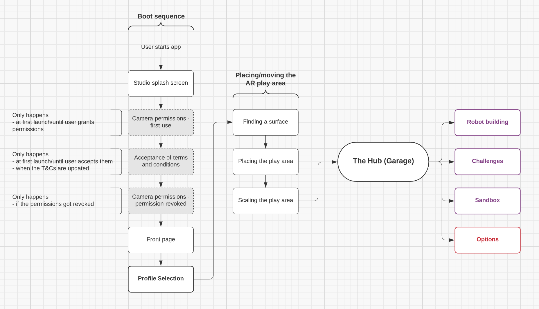
High-level user flow
My first step was to establish flow charts for the user journey through the app using Lucidchart.
This involved a lot of discussions and questioning back and forth with our Game Designer to try to cover as much as the user flow as we could, as well as testing several apps using AR feature and/or relevant to our target audience.
Boot sequence
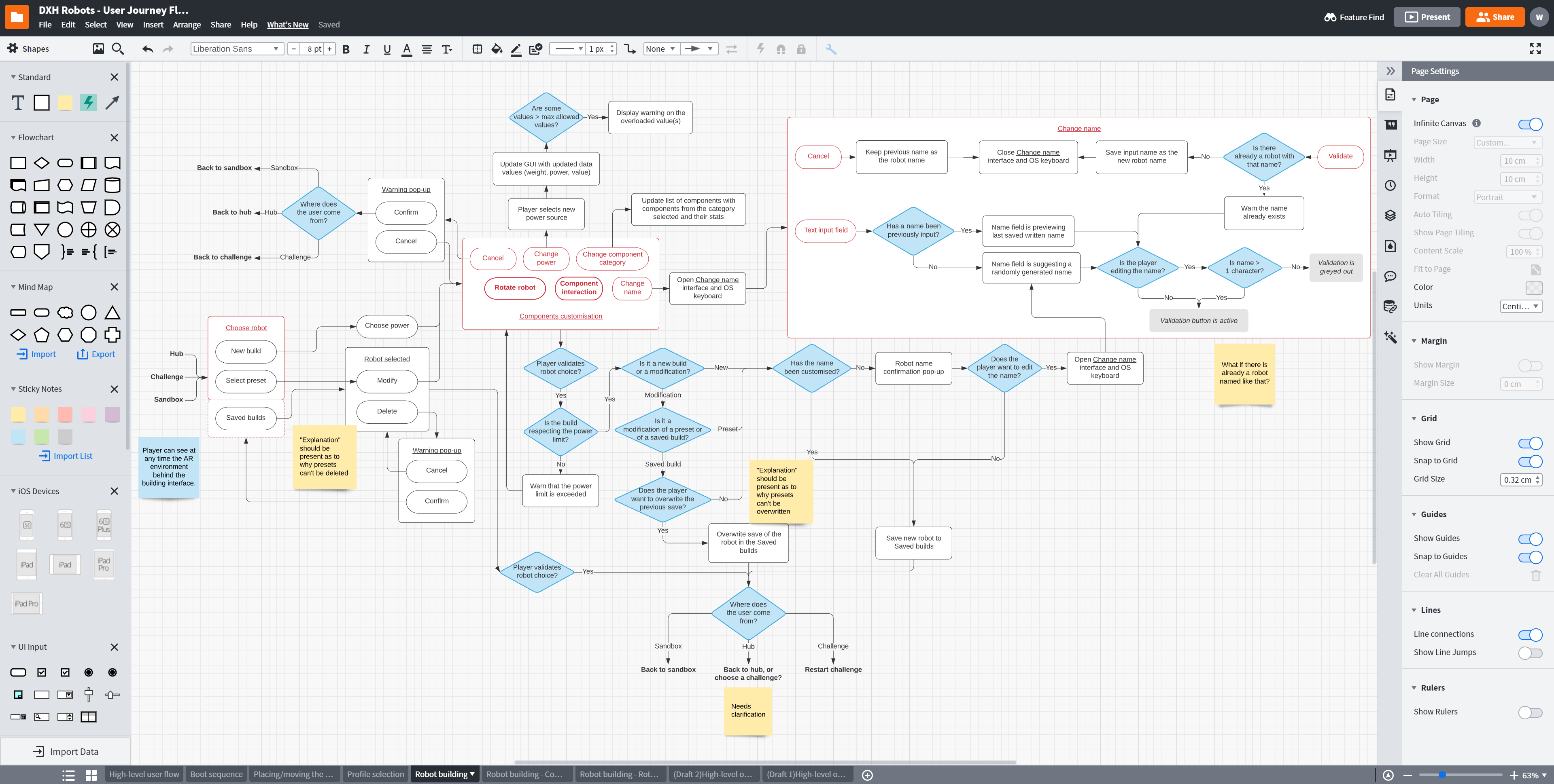
My goal was to make flowcharts that would be useful for the whole team: Game Designers, UX/UI Designers and Coders. I made high-level charts to have an overview of how the app or one of its features functions, and more detailed charts so the coders know how each button or feature should specifically behave, and anticipate issues before they happen. These charts were ultimately used in the Game Design Document and were extremely useful as a conversation support to picture what the game would be.
Robot building
Wireframe mock-ups
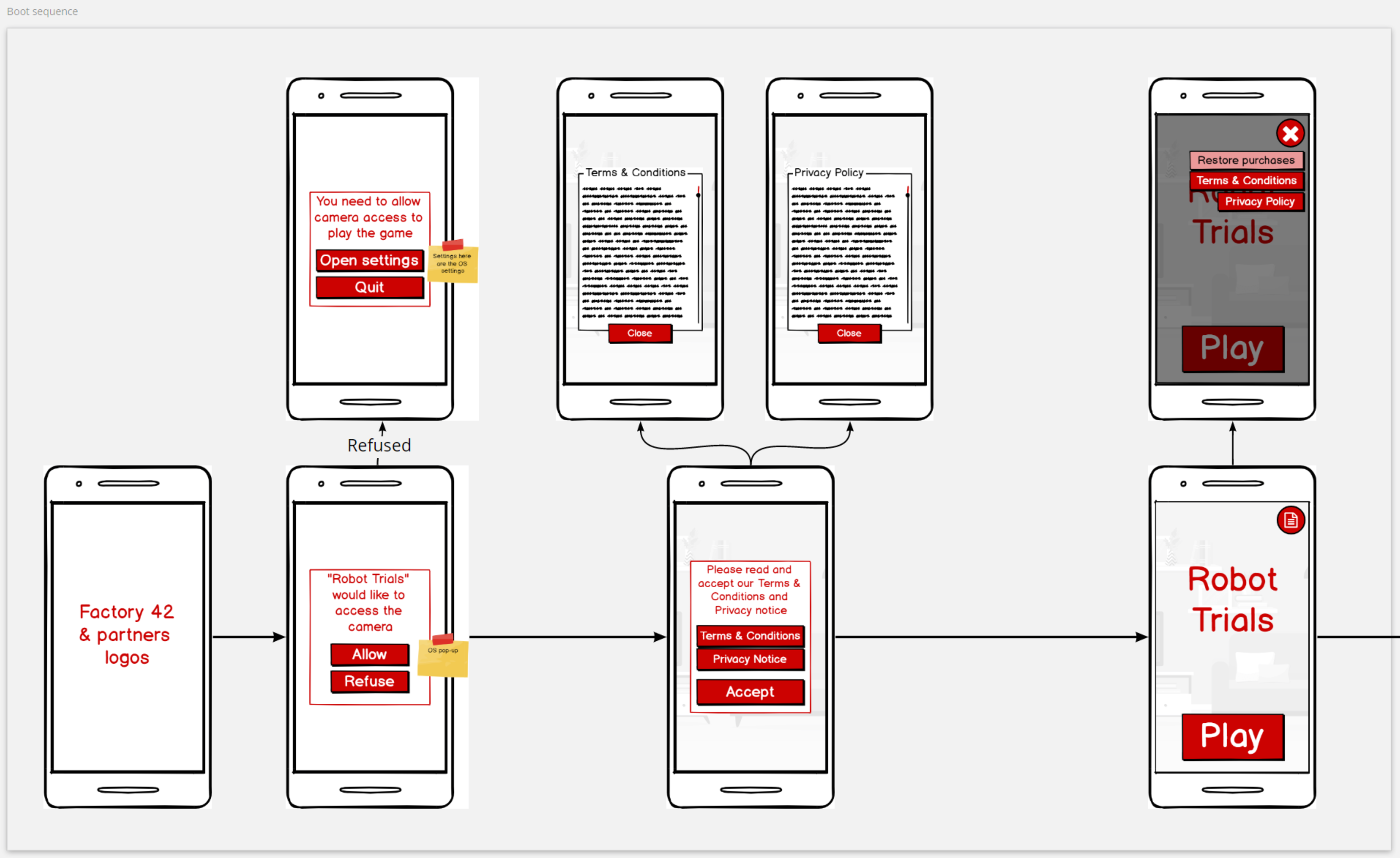
Boot sequence
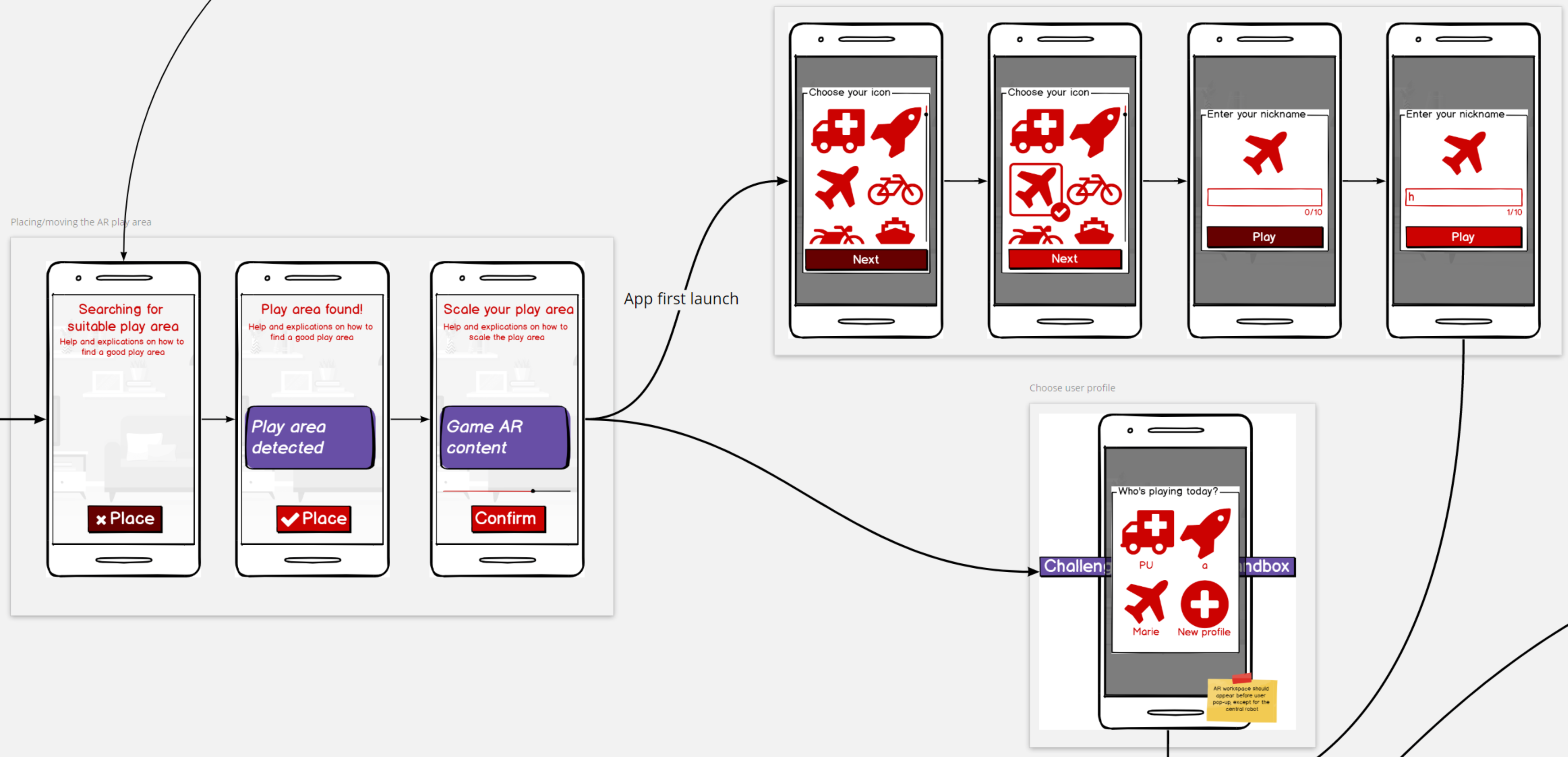
Using Balsamiq and Miro, I then created screen mock-ups to visualize the different elements that would be needed on screen, their rough layout, and overall provide an easier, clearer way for the whole team and producers to understand the flow of the app.
AR area placement & User profile selection
A difficulty that arises from working on an AR app is how to distinguish 2D screen elements and 3D world space elements in the UI mock-ups, given that most (if not all) UX/UI design tools rely exclusively on 2D screen space design.
To differentiate the two, I have established a colour scheme for anything regarding UX: purple would be world space UI, and red would be screen space UI; whether the feature is being discussed in a flowchart, in the Game Design Document, or in a wireframe mock-up.
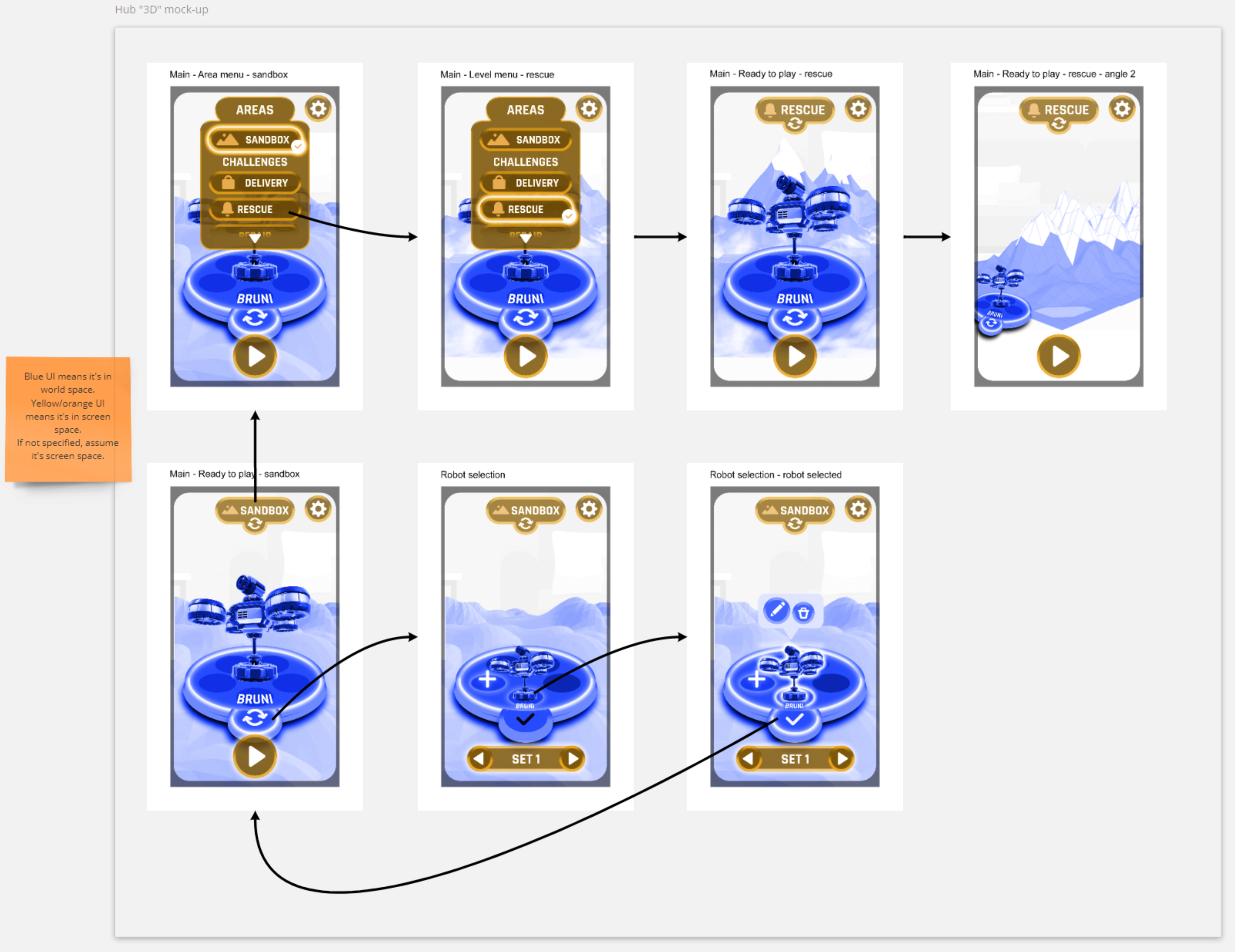
Hub "3D" mock-up
A problem was that for some screens or features, such as the hub of our game, using colour-coded 2D mock-ups wasn't enough. So I went ahead and created a rough mock-up of what I was envisioning in Photoshop, using 3D placeholder renders to illustrate better my idea.
I kept the colour code idea to make the difference between 3D and 2D clearer, however I realised that my previous choice of colours (purple and red) might not be accessible for someone with colour blindness. After some research, I settled on yellow and blue as they seem to be the colours that would be the most easily distinguishable by most types of color blindness.
UI & Art direction
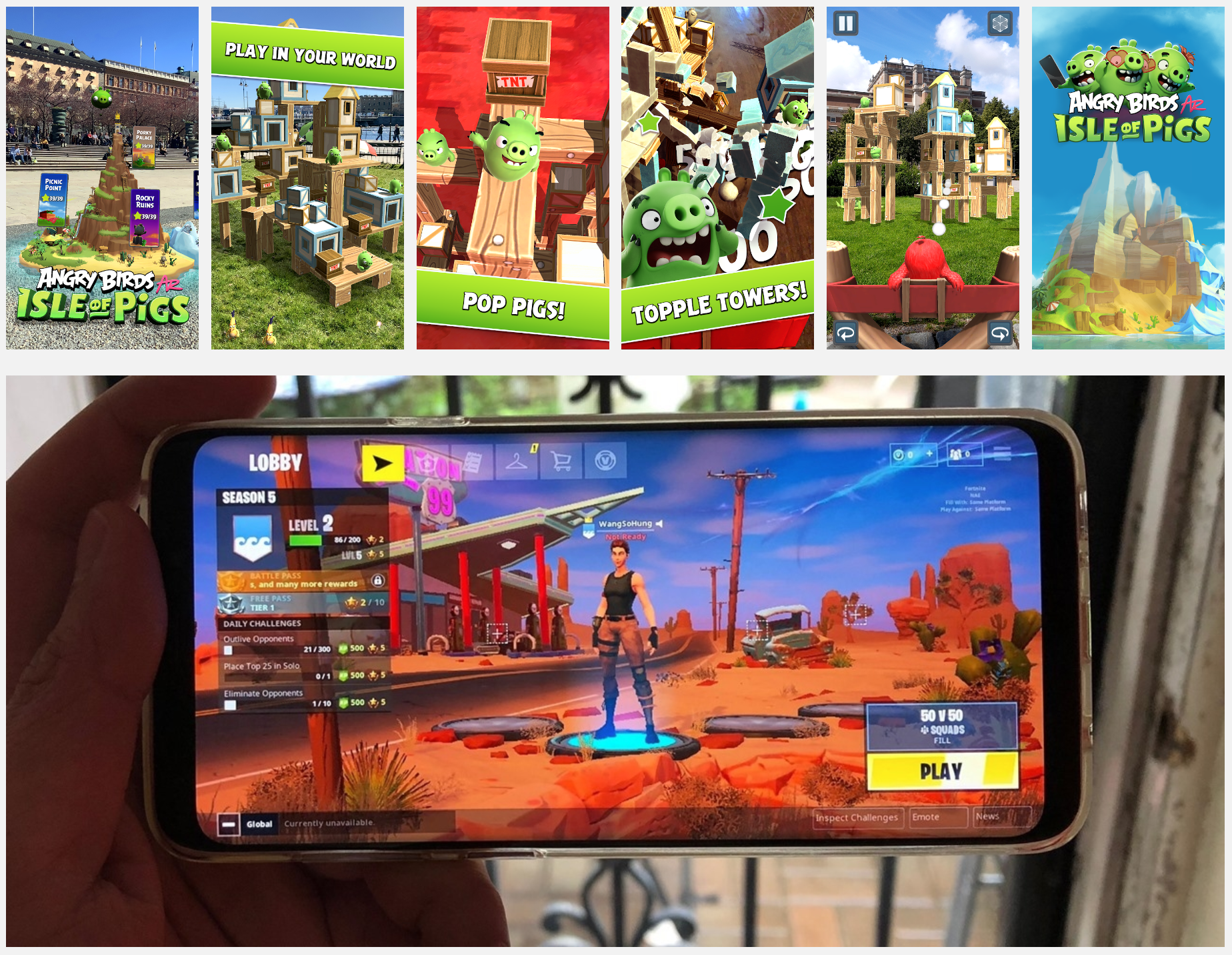
References
Based on user research and a quick analysis of the market, I have determined that our audience would be receptive to a simple, flat UI that wouldn't be infantilising, like the one used in Fortnite, which has a fun vibe by looking wonky. Having a flat UI would also be a huge speed boost much needed for our tight deadlines.
On top of this, AR is better appreciated with a floating UI, in order to fully enjoy the camera feed in the background. We also needed to have a good contrast for the texts on an opaque background, in order to be accessible to kids with dyslexia.
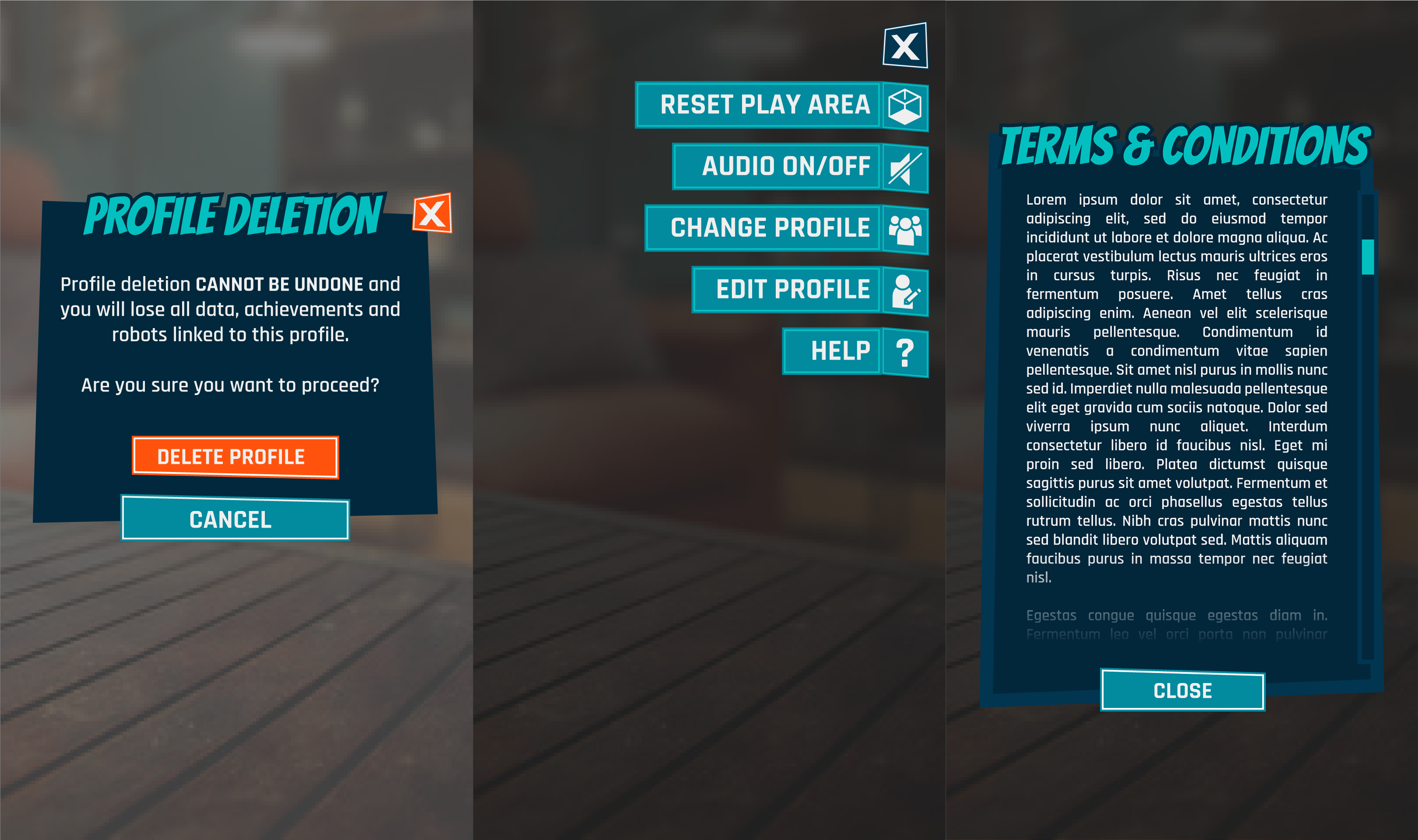
With this information, I have researched and chosen a set of two fonts, and a colour scheme with a tech and punchy vibe, by leaning towards cyan blue to avoid gender bias.
First draft of UI style and mock-ups
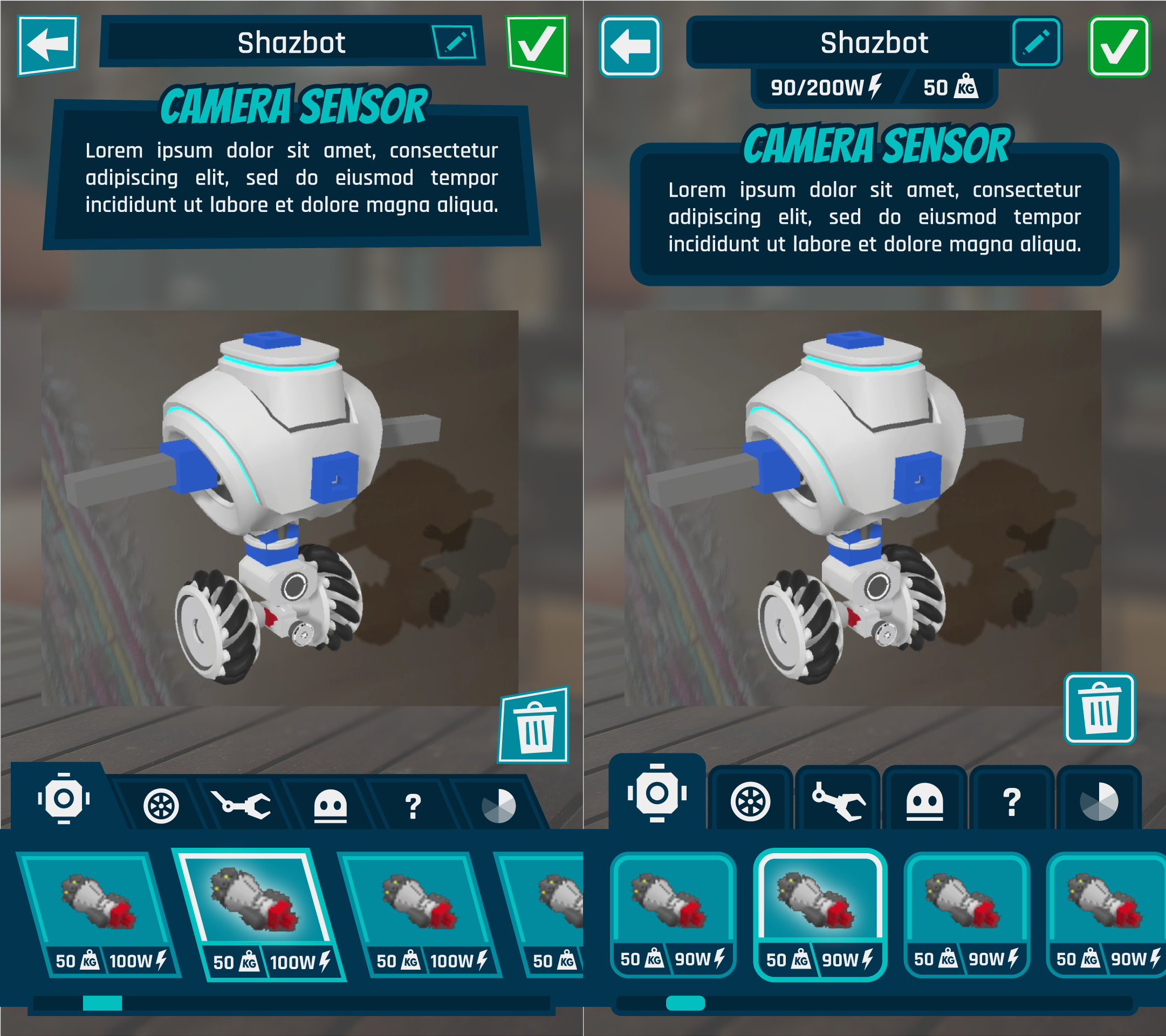
First drafts of robot building screen mock-up
However, a new constraint appeared unexpectedly, requiring me to create a UI that would be suitable for both Robot Trials and the other app being developed, which is about Dinosaurs and targeting a younger audience.
Judging that having sharp shapes would be less welcoming to a younger audience I have in a quick turn-around decided to change all the frames and buttons to rounded square shapes, which would make them more adapted to a younger audience, and would help implementing the assets in Unity more easily. This design work is done in Illustrator, as I find working with vectors fast and efficient for this kind of UI design.
Assets export
Exporting the assets is a crucial step between screens design and Unity implementation, as it will define how much freedom I will have to edit the UI in Unity.
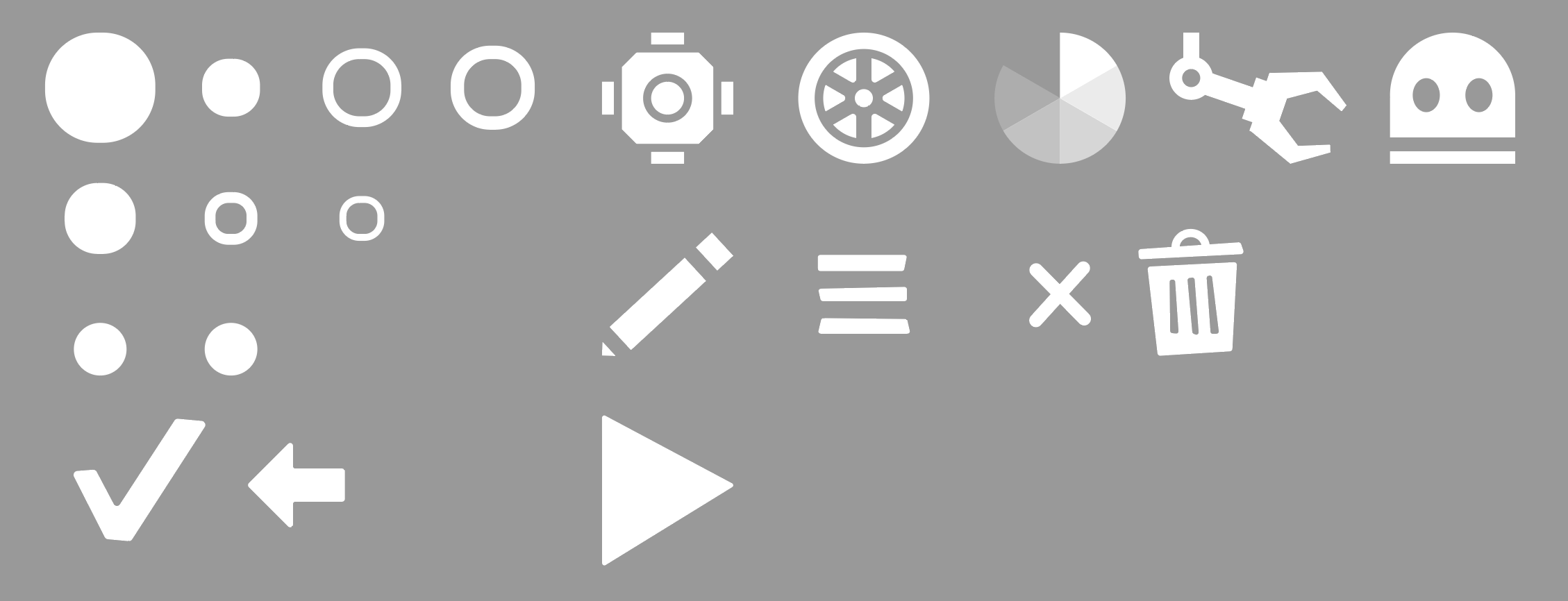
Our two apps being released on phones/tablets and needing to have a common UI because of time restrictions, it was especially important to have a lot of flexibility to work fast in engine. Which is why all the UI assets (not all present on this image) are exported in plain white and at a small size: the rounded squares in the top left are all fills and strokes of the buttons and frames that need to be set up in Unity with 9-slice scaling.
Thankfully, with Unity's built-in sprite atlas packer, there is not need to worry about packing an atlas or exporting the assets with power of 2 dimensions anymore!
Unity integration
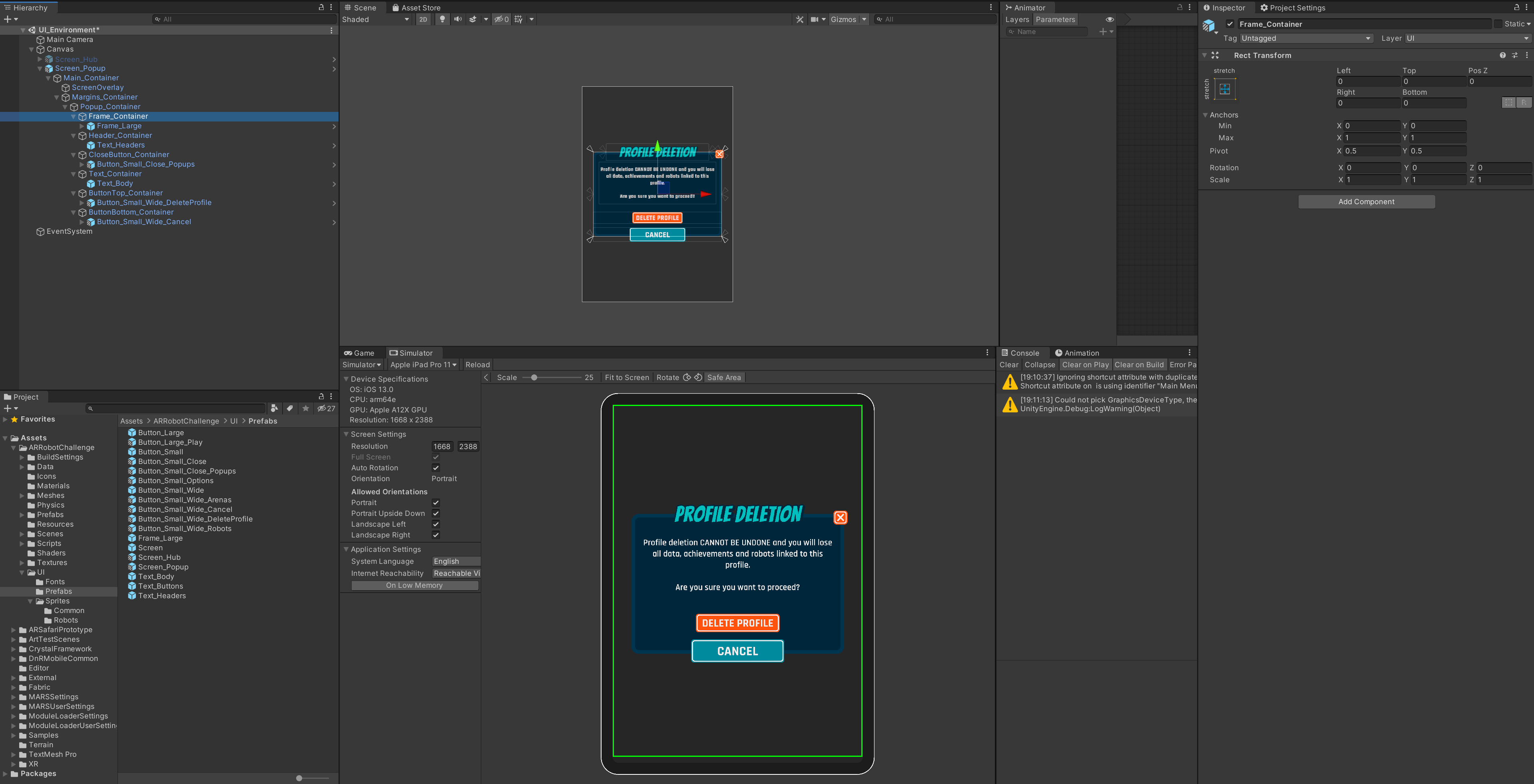
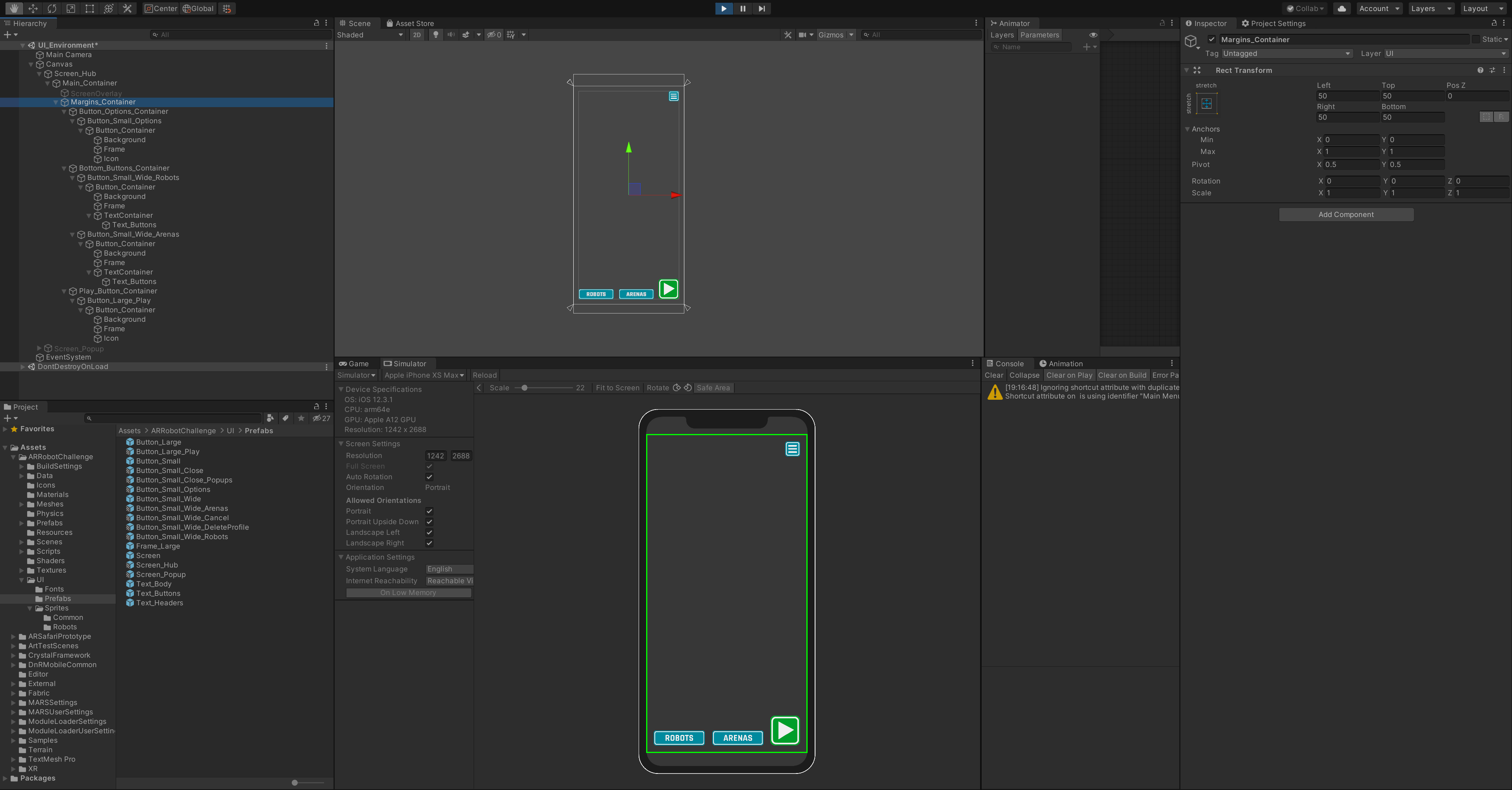
The workflow for the Unity integration of the UI is entirely prefab-based. All screens are being built as prefab, with nested prefab of buttons, texts and frames within them. This allows me to very quickly edit any colour or text that will be updated throughout the whole game in a few clicks.
With the appropriate canvas settings and a script to maintain the UI within the safe areas (such as the iPhone X notch requirements), the UI is easily scalable, maintaining a good aspect on any screen resolution; and if an issue were to arise during playtesting, changing the base Screen prefabs will make it an easy fix.
